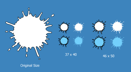
New forum icons
Moderator: Forum Moderators
-
Woo Elephant Yeah
- Heavy

- Posts: 5433
- Joined: October 10th, 2004, 17:36
- Location: Bristol, UK
- Contact:
New forum icons
Well what do you think?
-
Dr. kitteny berk
- Morbo

- Posts: 19676
- Joined: December 10th, 2004, 21:53
- Contact:
-
Woo Elephant Yeah
- Heavy
- Posts: 5433
- Joined: October 10th, 2004, 17:36
- Location: Bristol, UK
- Contact:
-
Gunslinger42
- Ninja

- Posts: 1448
- Joined: February 12th, 2005, 17:53
-
Woo Elephant Yeah
- Heavy
- Posts: 5433
- Joined: October 10th, 2004, 17:36
- Location: Bristol, UK
- Contact:
Yeah I wanted them bigger to be more obvious, but at the same time take up no more room by making the vertical space scroll more (if that makes sense).Gunslinger42 wrote:I like them, but they seem a bit big.
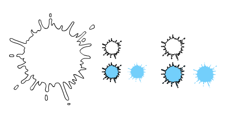
Any smaller and the 5punky splat is impossible to do, and I really wanted to make more of a trademark of the 5punky splat.
If people hate it, I'll change it back, but thought we could run with it for a bit and see what people think.
-
Dr. kitteny berk
- Morbo
- Posts: 19676
- Joined: December 10th, 2004, 21:53
- Contact:
-
Sheriff Fatman
- Optimus Prime

- Posts: 1132
- Joined: March 5th, 2006, 22:54
-
ProfHawking
- Zombie

- Posts: 2101
- Joined: February 20th, 2005, 21:31

I like them. I like having a 5punky trade mark, and with the top of the site redisigned I think the rest of the forum is hanging behind a bit.
EDIT: Also, after seeing quite a few other forums no my travel through the intarweb I've noticed a lot of them are very similar to each other. 5punk already looks unique, and the more we do to make it stand out the better I think.
EDIT: Also, after seeing quite a few other forums no my travel through the intarweb I've noticed a lot of them are very similar to each other. 5punk already looks unique, and the more we do to make it stand out the better I think.


This. In principle I like the idea, but they need refining/sharpening. I've always found that with the old ones I didn't look at them as a section of the 5punky splat but just more of a random shape. Having the whole shape makes it more obvious what they are, but in their present form they do look a bit rough around the edges (he says with 2 week's worth of stubbleDr. kitteny berk wrote:Look ok, but need some work, they look at bit low quality atm

Actually, after a few mins of browsing the site I don't like them at all, not in their current state. They just look too scruffy. I'm going to join Sheriff in the non-technical experts group though, as my tattyshop skills roughly equate to those of a 5 year old's crayon drawings of a house and a tree and his mummy and daddy*.
*I did one of these at primary school and they were made in to plastic plates which at the time was very cool indeed. There was a second one of me as superman which is equally ace.
*I did one of these at primary school and they were made in to plastic plates which at the time was very cool indeed. There was a second one of me as superman which is equally ace.
Afraid I have to agree with the scruffy thing. They just don't seem to fit in with the overall look and feel of that part of the board...squares for empty, splats for new posts, square borders. I think to make splats fit you'd need a complete redesign of the theme for the forums bit.
Btw I've not said so before but I think the mouseover index button rocks but the logo on the left looks like it's been badly photoshopped. Dunno if this is deliberate but the U in particular looks like somone accidentally airbrushed the border too much.
Btw I've not said so before but I think the mouseover index button rocks but the logo on the left looks like it's been badly photoshopped. Dunno if this is deliberate but the U in particular looks like somone accidentally airbrushed the border too much.
-
Woo Elephant Yeah
- Heavy
- Posts: 5433
- Joined: October 10th, 2004, 17:36
- Location: Bristol, UK
- Contact: