
Press Release here
Changelist:
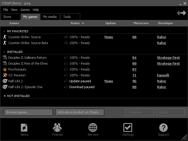
-Guest Passes
-Background Client Updates
-New User Interface
-Favorites
Major Steam Update coming
Moderator: Forum Moderators
-
Dr. kitteny berk
- Morbo

- Posts: 19676
- Joined: December 10th, 2004, 21:53
- Contact:

That skin looks far better than the old one, I dont like blobby skins, although it looks like they've just copied this guys skin: http://www.cstrike-planet.com/steamskins?img=809

http://storefront.steampowered.com/v/im ... sidian.png
That looks far, far too like Songbird
http://www.songbirdnest.com/
That looks far, far too like Songbird
http://www.songbirdnest.com/
Why is that bird farting all over the place in their (lovely) artwork?MrGreen wrote:That looks far, far too like Songbird
http://www.songbirdnest.com/
-
Dr. kitteny berk
- Morbo
- Posts: 19676
- Joined: December 10th, 2004, 21:53
- Contact:


Which looks like a negative image of iTunes.MrGreen wrote:That looks far, far too like Songbird
http://www.songbirdnest.com/
-
Dr. kitteny berk
- Morbo
- Posts: 19676
- Joined: December 10th, 2004, 21:53
- Contact:
Oh. My. Fucking. God.
Possibly the least intuitive interface EVER.
Looks nice, seems to handle well enough, but the UI needs someone to design it, not vomit buttons and icons at a window.
Edit: to clarify as a media player, the basics are all easy to find and stuff, but i made a playlist, then it took 2 mins to actually /find/ the playlist i'd made.
Last edited by Dr. kitteny berk on January 6th, 2007, 18:49, edited 1 time in total.


actually, according to the constructs and principles of HCI (human computer interface/interaction) it's actually a very good example of usability, although what the arrows on the top right do is unclear and the whole thing seems a little cluttered, but given the amount of screen space they wanted to use i think its a very good design.