Woo Elephant Yeah wrote:I just get the feeling that the forum doesn't tie in with the site very well
By 'the site' do you mean the front page? For me the site is http://www.5punk.co.uk/phpbb/ as that's where I spend most of the time - I only go to the main page to look at the TS thingy, which is probably twice a week, just before a game.
That's just how I 've got used to using it, and I'd almost forgotten that the main page was what new people see first, as it's the address we advertise.
FatherJack wrote:
By 'the site' do you mean the front page? For me the site is http://www.5punk.co.uk/phpbb/ as that's where I spend most of the time - I only go to the main page to look at the TS thingy, which is probably twice a week, just before a game.
That's just how I 've got used to using it, and I'd almost forgotten that the main page was what new people see first, as it's the address we advertise.
this, actually.
As far as colours go, I think it comes down to this:
Reasons to keep them:
1)they look nice
2)we are used to them
3)they have kinda become part of the whol 5punk identity
Reasons to change them:
1)erm...
2)because..change is ...good, or something?
I think maybe having a look at the layout of the site, and the deisgn of, for instance, the little nav bar at the top (as it gets kinda lost up there).
Also, I would like to add my own personal
NOOOOOOOOOOOOOOOOOOOOOOOOOOOOOOOOOOOO!
to the idea of ts stuff in a frame. Not because I have anything specific against frames (other than them being slightly on the ugly side), more because they will get in the way of the forum. Forum is for messages, anything that gets in the way of the messages is, in my opinion, baaad.
The only thing I think you should change is the grey buttons up at the top. Keep them the same order, just make them fit the banner and maybe square them off with it also.
Now this is an idea I like. Nice overall layout there Jack, but also the content and style of the representation made me pfffffffft myself.
The front page could benefit from having slightly more dynamic info on it, rather than just the news being updated as/when necessary. Things like "latest 7 topics started" and having details of users on the front page could make it seem like a more active site than it initially looks just now. We all know that lots goes on in here, but since it is essentially a forum-orientated site, maybe make more of a feature of the forum on the front page.
ALL OF THIS! Yeah, cos we all know that the news on the front page isn't changed all that much, and things like Last 7 Topics could tempt people straight over to the forum right-a-way, which we all know where the real fun is at.
cashy wrote:how about an upcoming birthday list, kind of like the 5chedular on the front page? seems a bit silly how the game 5chedular is clogged with birthdays
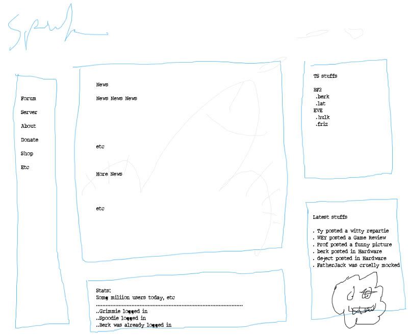
I've been trying to avoid housework by taking a step back and looking at the site today, and I've had a few thoughts:
The forum index (for many of us the main page) looks very different from the rest of the site. There is a theme, but it's pretty loose. As most of us see the forum index as the main page wouldn't it be worth altering the front page, or the index, or both, so that there was a strong theme that identifies all the pages as part of the same site?
The front page, for me, is a bit text-heavy. The first thing you see is the news - a big block of text, which isn't the most inviting of welcomes. It might be the kid in me, but coming onto a website for the first time I like to be greeted by pictures that describe the site. I can then take in the information at my own pace and start navigating for the bits I want.
Then you notice the TS server, which is well placed on the front page but the colour looks wrong. If it could be on a blue background it would look more natural. Don't know how easy this is to do. Generally though, coming onto the front page and seeing a well integrated real-time TS panel is pretty nifty and quite professional looking.
Then there's 5punky, hiding in the corner. I think he should get a more prominent place - he's the site logo and identity and as such should be immediately obvious to a new visitor.
Next there's the top bar. As I've mentioned, I think this should be a theme throughout the site - an ever-present constant that instantly identifies any page as being an extension of the front page. Slight variations on the forum header might be nice, for example the basic header for the front page, then adding a relevant picture for each forum.
Lastly there's the link buttons. These are good and clear, but could maybe benefit from being expanded into the sub-forums too for people who might just be looking to play one game, or who might be attracted more to a specific game they play than a generic games link. Again some nice little images might benefit, although they might prove confusing too.
Oh yeah, Dave Teh Monkey. He's great, he should stay.
Like I say, just some thoughts. I don't know how much of this is feasible for poor Mr Stoat but I'd be prepared to knock out the artwork for any of this that was adopted to relieve some of the workload.
Just let me know what you need and I'll crack on with it. I've not made web graphics before, but I'm pretty handy with potatoshop so I'm sure I'll pick it up.
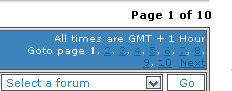
I've mentioned this before in a long-lost thread, but could you change the colours of this bit at the bottom please?
I find it almost impossible to read to be honest. Also, could you create a button that toggles pagination/show all for the threads within a particular forum? It would make finding things a lot easier, since the search function doesn't always find whatever you're looking for.
Lateralus wrote:I've mentioned this before in a long-lost thread, but could you change the colours of this bit at the bottom please?
I find it almost impossible to read to be honest. Also, could you create a button that toggles pagination/show all for the threads within a particular forum? It would make finding things a lot easier, since the search function doesn't always find whatever you're looking for.


