Page 1 of 2
5punk.co.uk Forum Review
Posted: November 24th, 2006, 21:54
by Woo Elephant Yeah
The following review has been done on 5punk, and I would appreciate all of your input on what's been said.
http://www.theadminzone.com/forums/show ... 9&p=218405
I stupidly forgot to split your replies in the other thread before deleting it, so I would appreciate it if you posted your thoughts/suggestions about the review again, if only to cover the bits you agree on.
Personally I'm happy with the review, and there are a number of things I will definitely take on board, and start working on straight away.
At the same time a few things I'm not so sure about changing, and like the way they are.
The lady who reviewed the site owns one of the largest forums on the internet, and reading through past reviews she has done, I agree with pretty much everything she has said, so I'm quite glad we got a review by her narf.
This site enables admins like myself to gain a fresh look on their own sites, and also a method of sharing skills/suggestions with other forum admins.
You should all pat yourselves on the back for making such a good impression

Posted: November 24th, 2006, 21:58
by Grimmie
Good review, agreed with whoever else said that Geneal/Discussion board should be kept seperate, it really is something you'll only understand when you've used 5punk for a while.. Disco board is for when Ty's drunk, or we find something amusing. It's for Vladimir to pop his head in and say hello, and for RO-BO to take over.
General is just.. Well.
General!
Top review, to go with a top site
Posted: November 24th, 2006, 22:16
by Roman Totale
From what I've read, the only only criticism of the site they have is that of the design - and I'm sure* that's something that is easily remedied.
As long as the community and 5pirit of 5punk is positive, I for one am happy.
p.s. needs more

and

*
I actually have no idea
Posted: November 24th, 2006, 22:22
by Gunslinger42
I agree with the point about the small little navigation thingy's up at the top, I've never been a big fan of them, and I somewhat agree about making a general section for games with reviews, general gaming stuff etc, though I don't think we'd (and by we I mean I) care all that much about gaming news other than when a particularly good game is released.
Posted: November 24th, 2006, 22:58
by cashy
Gunslinger42 wrote:I agree with the point about the small little navigation thingy's up at the top
Yes, me too
Gunslinger42 wrote:when a particularly good game is released.
Just a thought, how about adding a bastard child to the 5cheduler for sticking the release dates (and comments/ who is going to buy it) of games coming out in the future? Im not overly sure if this would work, but im just throwing it out there.
I think its probably a good idea to keep the FPS and morph reviews in one place, but she may have a point about uploading them onto free public review sites like gamefaqs and the like.
Oh and also she is right on the placement of the arcade, its not a forum so shouldnt really be there
Posted: November 24th, 2006, 23:19
by shot2bits
i just read through that review and thought there where some nice comments in there, but with the constructive critisism they made, i didnt agree with any of it to be honest, i like the site layout alot, its easy to navigate and is very clear, means you dont get pissed of with it, i think the text on the tool bar at the top and the icons for xfire etc at the bottom of peoples posts is a good size, doesnt take up much room and it is easily readable, infact the only part i did take note to being maybe helpfull in the main page bit, as i never use it, but now that i look at it, it could use a bit of a makeover as it doesnt seem the same quality as the rest of the site, and could maybe use a news section like it used to as it does inform new people that the site is being used if the news is updated reguarly
Posted: November 24th, 2006, 23:26
by FatherJack
Generally agree with the review, good to have an outsider's view of what's confusing to a first-time visitor, which regular posters have just learned to adapt to.
We've all talked about the design before, particularly the front page, and hopefully the people on that forum can help with some of our more ambitious ideas.
As for colours...well 5punk is 5punky-blue and while it might look a little similar to some default schemes, to change it we'd probably end up coming up with 10 different designs and all voting on a different one - so unless there's a 'theme chooser' personalisation option it's probably less shag to leave the overall colour as it is. Adding a splash of another colour here and there isn't a bad idea, but perhaps only in the icons or menus.
Almost my first post here was about how signatures clog up a good read, so I'm glad we're free of those, and of adverts.
Widening the audience is an...interesting idea. The reviews are sometimes contentious, but balanced out by comments, and video reviews are public as soon as they're youtubed anyway. It's an area which could reflect well on us if picked up by blogs or news feeds, and I'm very honoured as a mod of the section that it's produced such great reviews and lively comment.
The connection with b3ta, while good in explaining the history, isn't really where we're at now. I would hate for someone to see the reference, go to b3ta and think that whatever random images (fluff/nastiness) were on there at the time was what we were about. Like Roman said, bit of something about the 5pirit of 5punk/robohorses and other memes unique to 5punk, without being utterly confusing.
I loved the shocked face in the review at being unable to find any rules. While we're not entirely self-policing, people generally just know when somebody did a bad. I don't think we can document this, and most likely wouldn't want to.
We've talked about the arcade before, although I was a bit surprised the reviewer felt it needed MORE games. Perhaps attractive to first-time visitors, but there doesn't seem to be much interest from regular posters, as there's scarcely any talk about it. Big users of it probably bookmark it and go straight there, so it's prominence in the forum list isn't really an issue.
There's a bit to discuss, and I like the fact we always do discuss stuff, even if it means that we only ever all agree that we like 5punkyblue and we're all here because of The 5punky Way.
Posted: November 24th, 2006, 23:29
by MIkkyo
I like 5punk
the forums not bad either.
Posted: November 24th, 2006, 23:33
by shot2bits
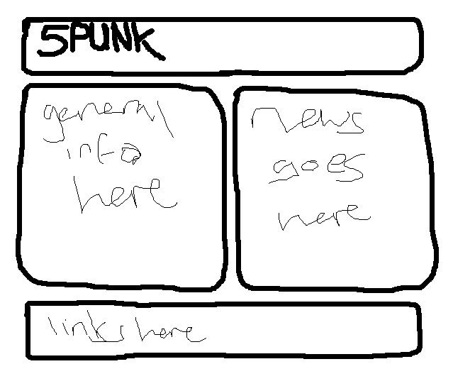
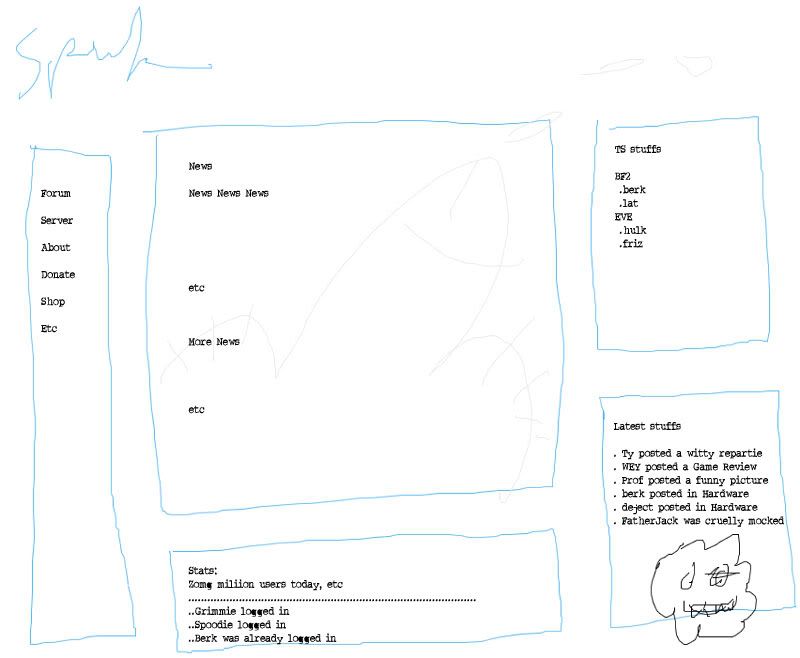
so out of being bored and having nothing to do i decided to come up with a very basic design for the front page, hooray for paint
Posted: November 25th, 2006, 0:16
by FatherJack
Posted: November 25th, 2006, 0:41
by Woo Elephant Yeah
I think I've found the droids I was looking for!
http://www.mkportal.it/
Piece of piss to integrate and supposedly very easy to customise.

P.S. Thanks for the comments so far guys, they are really useful

Posted: November 25th, 2006, 1:44
by Hehulk
That links shagged, for me anyway.
Only real thing I can think of to gripe about regarding 5punk (Berk aside

) is that the new discussion board (which I do mostly like) generates a new url every time you post something. Is that complely required, or is there any way to fangle it so it doesn't generate urls like the old one didn't?
Posted: November 25th, 2006, 1:58
by friznit
Blue and White is defo good. Too many colours would take away from the simple, clean design. I detest boards with too much crap everywhere (Something Aweful being a case in point). This is clean, functional and really nice to find your way around (and fast).
As for rules, we're very good at policing ourselves - partly because we so active and also (dare I say it) so damned friendly - see the Introduce yourself forum - we have a (not so) subtle way of re-educating the l337ers to speak in proper English for example.
Then there was this:
For anyone that thinks only teenage boys play games instead of studying should be pointed towards this community where it is clear alot of interesting and intelligent adults join together to discuss gaming.
...
Bwahahahahahaha

Posted: November 25th, 2006, 5:00
by Nickface
I read through the review, and I kept saying "eh..." or "So what?" to a lot of them.
The only real problem I ever have with 5punk is when i have to avoid explaining that I post regularly on a forum named after jizz...
Posted: November 25th, 2006, 5:20
by Dr. kitteny berk
as i said before, i think the comments for the icons and stuff were correct (given stuff said by members before)
the arcade and such shouldn't be in the forums section, though beyond that i feel the forums are arranged correctly (unless there (as i've said before) could be sub-forums added allowing some better organisation of the forums(
Otherwise, to make the site better for users (and expand our target) i feel that:
A news thingy would be good, as it'd make us a source for info on games, patches, etc. as well as a source for patches (if you know they're there)
It's also easy enough to just leech steam news etc and add comentary by news-posters to make us look more active, along with the potential for commentses etc within the news.
The actual web page could do with some work, along with the forums to match a little and improve on the buttons situation
more kittens.
However all of this depends what you want to do with the site and where you want it to go. adding news and downloads might add a lot of viewers, but only a few signups.
I think you sorta have to decide what you want to do with the place, then decide what needs changing (and we need to know so we can help you decide what to do)
Posted: November 25th, 2006, 6:26
by MORDETH LESTOK
-I like the game stuff on the bottom
-I liked the suggestion for seperating out the gaming news/reviews
-Maybe rename the "Discussion Board" to "5punk For Thought"
TM and move it under "General"
-Put "Introduce Yourself" in the top spot
I'm sober...leave me alone

Posted: November 25th, 2006, 15:45
by Dog Pants
h
Dr. kitteny berk wrote:I think you sorta have to decide what you want to do with the place, then decide what needs changing (and we need to know so we can help you decide what to do)
Agreed. More users can only be a good thing so long as it doesn't dilute the quality of the posts. I wouldn't like to see 5punk turn into a 'zomg u r so faaabulous' forum.
I'm sure that was relevent to the quote when I started it. I'm very hungover.
Posted: November 25th, 2006, 15:55
by cashy
The server page needs updating too, it looks rather bare. Even if you cant get the fancy 'how many people are playing' stats and stuff on there, it could do with just a basic list of IP addresses.
Also possibly an explanation that the servers are prone to going online/ offline due to usage and also that the games we host are continually switched around.
Posted: November 25th, 2006, 16:07
by Dr. kitteny berk
Posted: November 25th, 2006, 17:35
by Dog Pants
cashy wrote:Also possibly an explanation that the servers are prone to going online/ offline due to usage and also that the games we host are continually switched around.
Is there a way of having a button that'll Xfire Berk with 'Bukkake's down!!!!one!'?